• Pantone, a US-based corporation best known for its color matching system, recently proclaimed “living coral” as 2019’s Color of the Year.
• The company describes the color, a shade of orange with a golden undertone, as “buoyant, vibrant and effervescent.”
• This particular Color of the Year also calls attention to the dire state of the world’s coral reef ecosystems.
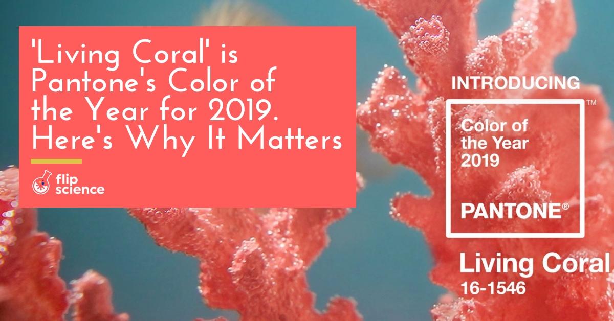
Every December, the US-based corporation Pantone announces the Color of the Year for the following year. For 2019, it’s an almost pinkish shade of orange-gold called “living coral” — and perhaps now more than ever, the Color of the Year deserves everyone’s attention.
The color of the global landscape
Pantone is well-known in the design industry for its color matching system. Officially called the Pantone Matching System (PMS), printer manufacturers, flag makers, and even hair stylists use it in color identification. The system assigns “Pantone numbers” to specific shades based on their lightness, as well as their hue and saturation (or “chroma”).
Pantone’s annual Color of the Year proclamations started in 2000. The organization determines which color best represents the predominant aesthetic or sociopolitical climate, based on extensive research about color influences in art, politics, and entertainment across the globe. They also travel to different cities worldwide to consult with design professionals and experts. In 2018, for example, the corporation declared Ultra Violet (Pantone 18-3838) as the Color of the Year — a decision that many associated with a call for political bipartisanship.
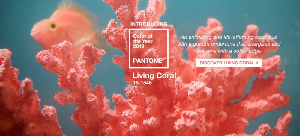
Living coral (Pantone 16-1546) is officially described as “an animating shade of orange with a golden undertone.” Based on Pantone’s assessment, the color represents optimism and joyful pursuits, as well as “authentic and immersive experiences that enable connection and intimacy” in the age of social media.
“With everything that’s going on today, we’re looking for those humanizing qualities because we’re seeing online life dehumanizing a lot of things,” according to Pantone’s vice president, Laurie Pressman. “We’re looking toward those colors that bring nourishment and the comfort and familiarity that make us feel good. It’s not too heavy. We want to play. We want to be uplifted.”
On colors, corals, and climate change
The name itself gives it away: Living coral represents and showcases the beauty of living, healthy coral reefs. For Pressman, it also calls to mind the urgency of mitigating the impact of climate change on reef ecosystems.
Coral reefs are a vital component of marine ecosystems, serving important functions such as providing a habitat for marine life and acting as a water filtration system.
Sadly, coral reefs have proven to be exceptionally vulnerable to the effects of climate change. According to a 2017 UNESCO World Heritage Centre report, 21 of the 29 World Heritage reefs have sustained repeated or serious heat stress. Among the sites that have suffered severe bleaching are the Great Barrier Reef in Australia, the Lagoons of New Caledonia in France, and Seychelles’ Aldabra Atoll. Meanwhile, ocean temperatures and CO2 emissions continue to rise. Unless an effective solution is set in place, the World Heritage coral reefs will die in less than a century.
As United Nations Secretary General António Guterres cautioned at this year’s UN climate conference: “We are in trouble. We are in deep trouble with climate change.”
More than anything else, perhaps, living coral can serve as a reminder of humanity’s collective responsibility to the environment. With any luck, future generations will be able to see the color in the world around them, particularly in the oceans — and the words “living coral” will mean more than just a painfully ironic reminder of beauty long gone.
Cover photo: Pantone
References
- https://businessmirror.com.ph/where-have-our-beautiful-corals-gone/
- http://time.com/5456481/pantone-color-2019/
- https://www.fastcompany.com/3050240/how-pantone-became-the-definitive-language-of-color
- https://www.nwaonline.com/news/2018/dec/25/imperiled-reefs-getting-respect-from-pa/
- https://www.pantone.com/color-intelligence/color-of-the-year/color-of-the-year-2019
- https://www.treehugger.com/culture/sad-side-pantones-color-year-living-coral.html

Author: Mikael Angelo Francisco
Bitten by the science writing bug, Mikael has years of writing and editorial experience under his belt. As the editor-in-chief of FlipScience, Mikael has sworn to help make science more fun and interesting for geeky readers and casual audiences alike.